Inspector
The property editor for the current selection, section by section.
The control section on widgets and buttons.
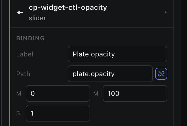
Components that act as operator controls — control-panel widgets and buttons — get a Binding section describing what they write.
| Field | Applies to | Meaning |
|---|---|---|
| Label | All controls | The visible label; it also becomes the component's content. |
| Path | All controls | The store path this control writes. |
| Min / Max / Step | slider, number | Numeric range and increment. |
| Event | button | The event name the button fires, e.g. playIntro. The bind button beside it opens the action dialog. |
| Options | select | One option per line. Use label=value when they differ. |
To bind an ordinary field to data instead, use the bind icon on the field itself — that arms the pick cursor and opens the Binder.