Components
The nine graphic component types and the six control widget types.
Typography, and text that follows data.
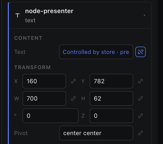
A text node paints its content string. Everything about how it looks lives in Appearance — font family and size, colour, alignment, padding, radius, shadow, overflow.
- Bind Content to a store path and the text follows the data; the field locks and shows the painted value.
- Overflow decides what a too-long name does: visible, hidden (the default) or clip.
- Upload a .ttf or .otf from the font row in Appearance to use a house face; it applies immediately.
- For a character-by-character reveal, use Container.lib.typeOn rather than animating the content.